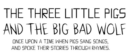
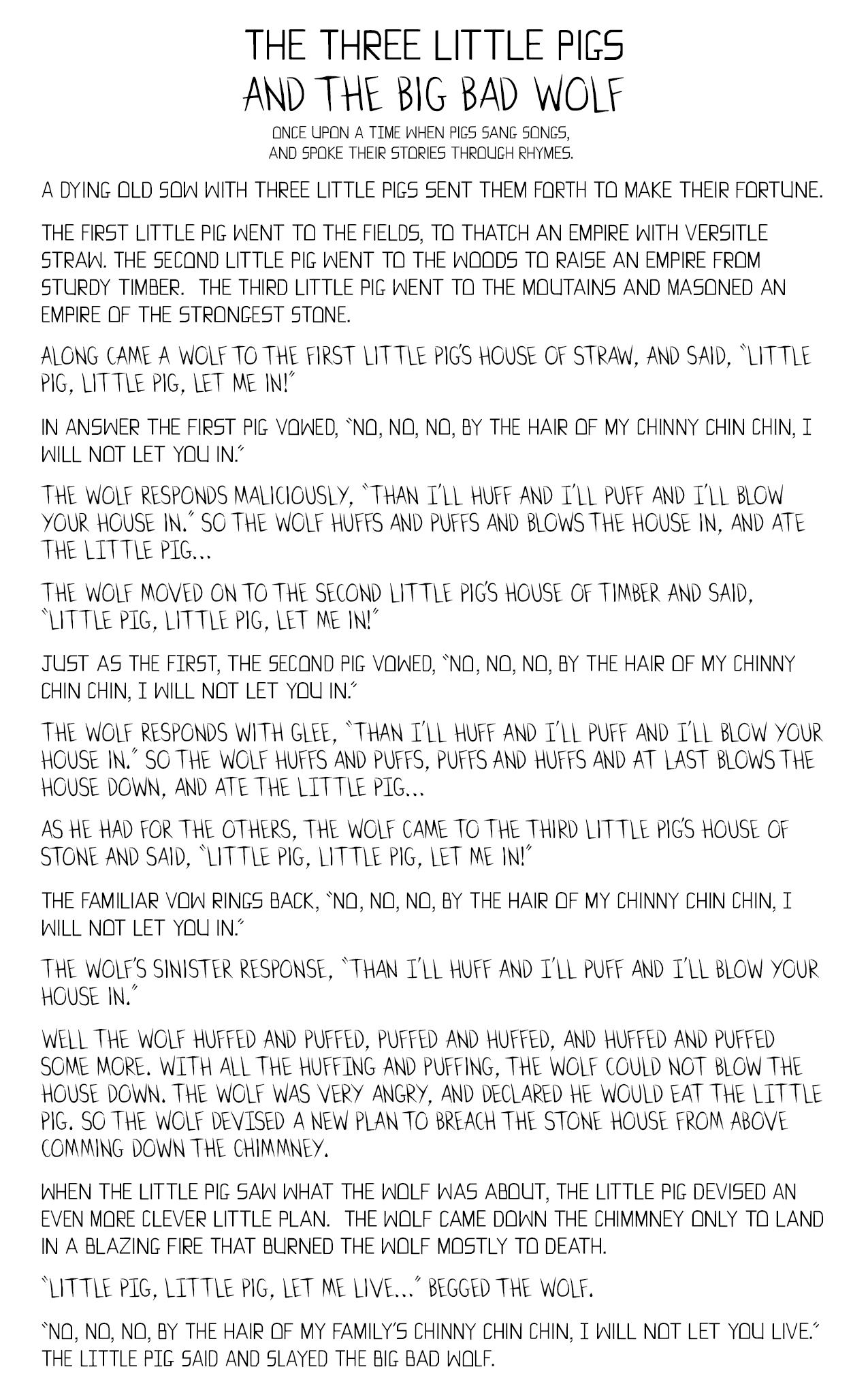
As part of an upcoming project, a graphic novel loosely based on the Three Little Pigs, I’ve been developing several fonts. The two fonts I’ve completed so far are comic book speech bubble fonts. As an exercise and to try out my new fonts I’ve rewritten the original Three Little Pigs fairy tale using my pig and wolf speech fonts for their respective parts in the story.
When creating these fonts I began with research, I found the advice in The DC Comics Guide To Coloring and Lettering Comics by Mark Chiarello and Todd Klein to be very useful. Even though I’ve made a computer font, I wanted the font to have a hand lettered feel. To this end I created a single case font where the upper and lower case versions would be slight variations of the same glyph. I also sought the advice of my friends and designers who had more experience creating fonts than myself. They directed me to create several design goals, the look and feel, that I wanted the font to convey. The pig’s Font I wanted to be structured and grounded, to reflect the buildings they make and their stern vows. The wolf’s font I wanted to be sharp and fierce, to reflect the killer instinct and sinister intent.

