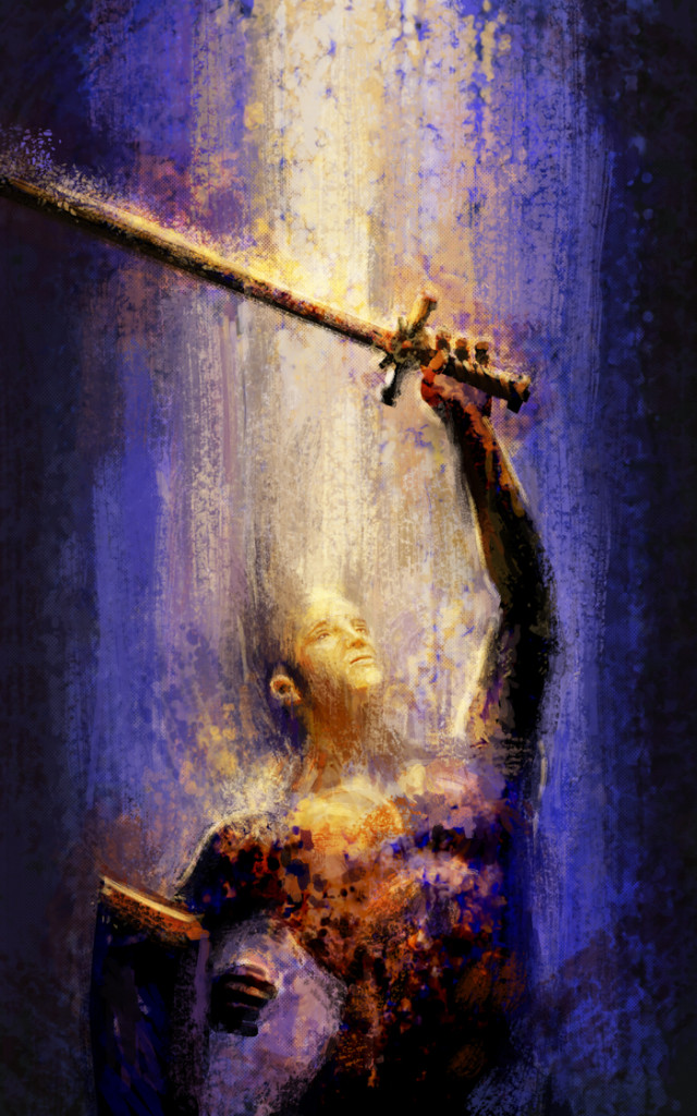
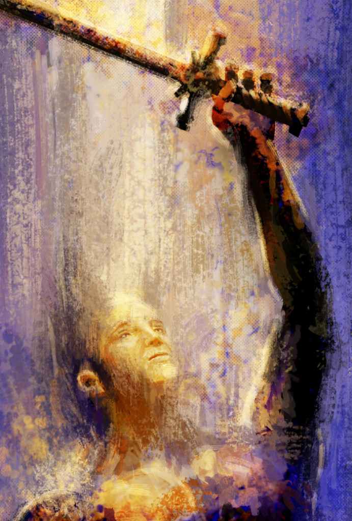
One of the things I’m working on while practicing my illustration is developing pre made book covers. The one I started working on last week was a very simple, often used cover concept, “man with a sword.” In spite of doing some fairly successful rough sketches and thinking it should be a very easy project, I found I was I was struggling. I was having some issues with my sketches but mostly I kept running into this problem where as the image got more refined and the character more developed I liked it less and less to fulfill the assignment I had set for myself. I wanted a man with a sword and to imply that there is some kind of story going on, but at the same time it needs to be ambiguous enough that it could fit many possible stories since I don’t know who is going to purchase it. After trying several times to develop a tight illustration I was getting very frustrated. So I stepped back and started just laying down a more abstract set of strokes. Trying to keep to a more traditional painting method and a more abstract concept I built up a much stronger image.
It’s not as detailed as most of my work but it manages to be engaging and hint at a story while remaining very open for interpretation. After completing this piece I’m excited to try to merge this looser style of brush stroke with my more tight illustration style and find a way to blend the two.

