When you work in a creative field one of the most important things to come to grips with is that you are never going to be your best. There are always new things to learn, new techniques to master, and new mediums to explore. It’s not a passive activity. You constantly are trying to develop your skills. You try to get who ever you can to look at your work, and you practice constantly. you not only have to learn to be critiqued, but how to provide feedback to other artist. In that spirit Josh and I have started what I hope to be an ongoing series on speed painting. In the exercise we are decide on a scene, we each speed paint an interpretation of the scene, then critique each others paintings. Then will post one of the basic critiques, and the reasons behind the feedback.
Today’s speed painting exercise:
Assassination Successful
Paint time: About an hour and a half.
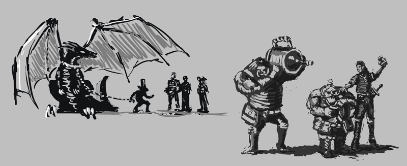
My biggest concern with my own painting was that I had foolishly suggested doing a crowd scene knowing that laying in characters, even just as background elements is something I still find very time consuming. So much so that after this exercise I’ve been practicing more on silhouette studies with several characters in a scene done very quickly. Here are a couple of the studies I felt where on the more successful side.
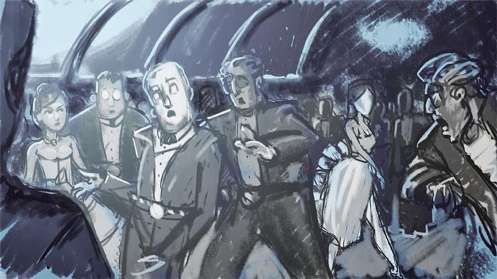
We decided the scene would be a sci-fi banquette where earths emissary has just poisoned the new leader of Alpha Centauri.
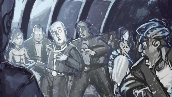
Josh’s interpretation of the scene after an hour and a half.
Given my own concerns about the scene, right away I’m struck by the variety and uniqueness of each of josh’s characters. We talk for a bit about getting that uniqueness and expression in characters and he suggested http://www.silvertoons.com/ for inspiration and recommended a couple books, Drawn to Life: 20 Golden Years of Disney Master Classes, volumes one and two, by Walt Stanchfield. Which I promptly ordered. Never miss an opportunity to find a new resource. I also really like the lighting he’s set up coming in through the large windows. At first I believe the story isn’t coming through as strong as it could. I didn’t suggest it while we were talking, but looking back, maybe he could be clutching his heart to reinforce he’s in distress and not drunk. I also did pick up that the woman on the right, who he didn’t have time to finish the face on, was probably the culprit, and the woman on the left suspects her. So although I feel the stories not as strong as it could be, the foundation is there and those issues would probably be cleared up as the painting developed.
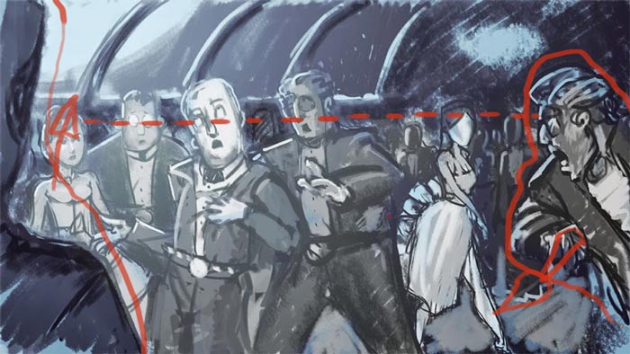
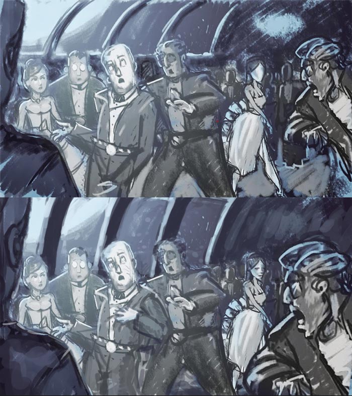
Compositionally there are two things I would adjust. First, although it is a good layout rule, I suggested that it would give more tension and depth to the scene if he shifted the bodies in the foreground a bit so not all the heads are resting on the upper third.
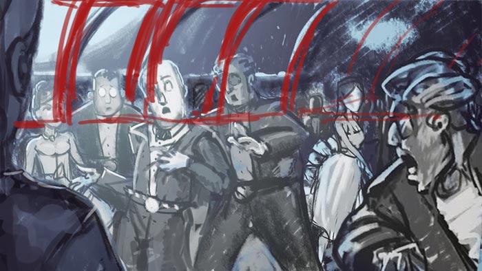
Second I would change is extending the windows down past the shoulder lines. I’m finding the horizontal line crossing behind their heads a little bit distracting.
Comparison between the original and my adjustments.
