A Starting Point
I started creating the Infinite Cortex Creations logo the way I often start logo concepts. I sit down at a coffee shop, I sketch, and I think. This must look very silly to the local barristers as I sit for an hour or two furiously scribbling circles and lines over and over again as I drink several very large iced chai lattes. But that’s my process, and taking the time to pencil sketch and work out what you want to express in logo can make all the difference in good and bad design. I decided I liked the design pictured above as a starting point. It only took four strokes to draw, making it simple, pleasing to look at… aaaaaand with the right imagination it could be a character’s head, with his brain exposed. I wanted to include the cortex into the design some how, without just drawing a brain.
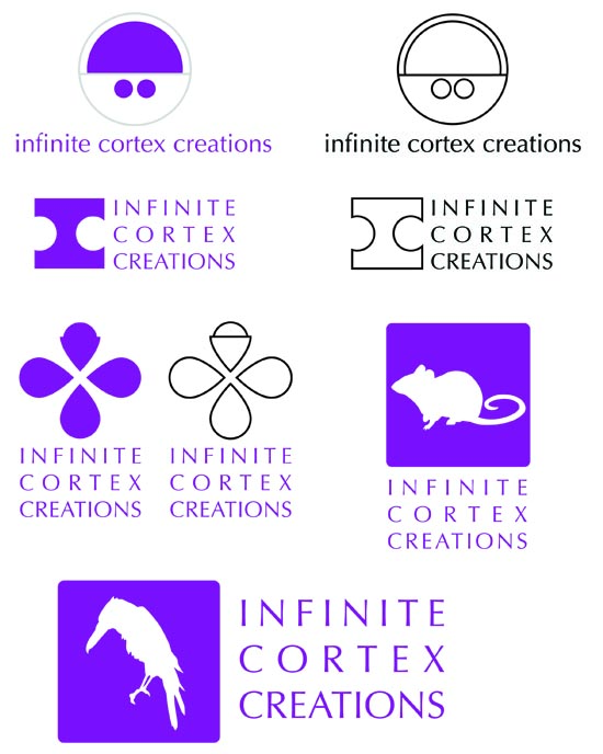
We had our first design meeting for the logo and I got every ones feed back. We decided it needed more of what I call the cortex part of the logo, and that it should include the infinity sign tastefully some how. We also were not sure it needed the outer circle. I then produced the fallowing concept sheet with a refined design of my original concept and some other directions we could go.
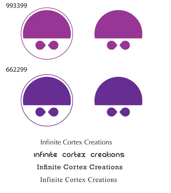
We selected the direction based off my original sketch and continued to refine it.
You’ll see in some examples in the next post how the ability to re-imagine the logo was a big reason we selected it.


